
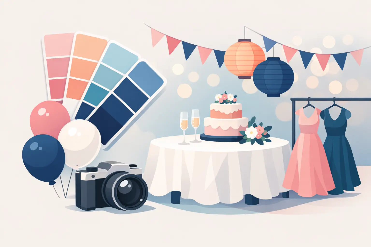
The right party colors do more than fill a room. They set the mood before guests read the welcome sign, make the cake table feel intentional, and help every photo look like it belongs to the same celebration. If you are wondering how to choose party colors, start with the feeling you want people to take home: playful, elegant, cozy, bold, sweet, or full of energy.
A beautiful palette does not need ten different shades or a complicated design board. It needs a clear point of view. Once you choose that, your backdrop, balloon garland, table details, favors, cake stand, outfit, and invitations can all work together without feeling overly matched.
Start With the Feeling, Not the Color Wheel
It is tempting to begin by picking a favorite color, but the better first question is: what should this party feel like? A first birthday may call for soft, joyful colors that feel warm in family photos. A milestone birthday might suit deeper tones, metallic details, or a more dramatic contrast. A corporate event may need colors that feel polished while still reflecting the brand.
Think of color as the first layer of your event story. Soft peach, cream, and sage can feel gentle and garden-inspired. Black, ivory, and gold create a refined, celebratory look. Bright pink, orange, and cobalt bring instant fun to a summer party. Even one color can look completely different depending on the shades around it.
This is also where personality matters. A palette should feel like the guest of honor, not simply like a trend you saw online. If your child loves dinosaurs but you want something stylish, muted greens, sand, and warm brown can nod to the theme without turning every surface into a cartoon. If the birthday outfit is a showstopper, choose décor colors that frame it rather than compete with it.
How to Choose Party Colors From Your Starting Point
Most celebrations have at least one useful starting point. It could be a theme, invitation, outfit, venue, dessert, floral arrangement, or company logo. Choose one main source of inspiration and let it guide the rest. Trying to combine five unrelated ideas is where party décor can start to feel scattered.
For a themed event, look beyond the most obvious colors. A mermaid party does not have to be only purple and turquoise. You could use seafoam, lavender, pearl white, and a touch of coral for a softer look. For a race-car party, black and red are classic, but adding white and silver gives the setup more dimension and helps the red stand out.
When the guest of honor has an outfit selected, use it as part of the design process. A cream dress can look lovely against blush, champagne, and soft pink. A royal blue suit may pop beautifully with white, gold, and hints of navy. This is especially helpful for cake-smash sessions, milestone portraits, and any celebration where photos are a major priority.
Your venue deserves a vote, too. Rooms with dark walls, warm wood, colorful carpeting, or patterned wallpaper already have a strong visual presence. In those spaces, a simpler palette often works best. A neutral community hall or bright home interior gives you more freedom to use bolder colors. Before committing, take a few phone photos of the space in daylight and evening lighting. The same shades can appear warmer, cooler, brighter, or duller depending on the room.
Build a Palette With a Clear Color Role
A polished party design usually has a main color, a supporting color, and one or two accents. This approach gives the eye a place to rest while still allowing for detail and personality.
Your main color should carry the largest visual impact. It may appear in the balloon installation, backdrop panel, tablecloth, or large welcome display. The supporting color softens or strengthens it. Accent colors are used more sparingly in details such as cake stands, cutouts, favor tags, ribbons, or small table pieces.
For example, a baby celebration could use dusty blue as the main color, white as the support, and gold as the accent. A Barbie-inspired birthday could feature hot pink as the main color, pale pink as the support, and silver or white as the accent. A tropical gathering might use bright green and coral as the main colors, then use cream or gold to keep the overall look elevated.
Neutrals are not boring fillers. White, ivory, beige, black, gray, and clear acrylic details give brighter shades room to shine. They are especially helpful when your theme already includes several colors. If you love rainbow details, choose one neutral base so the setup still feels organized rather than busy.
Use Contrast for Better Photos
Party colors should look good in person, but they also need to read clearly in photos. Contrast is what keeps the cake, outfit, signage, and décor from blending into one large block of color.
If the backdrop is very dark, a dark outfit may disappear in portraits. If the cake is pale pink and the entire display is pale pink, the dessert can get lost. Adding a contrasting base, a lighter panel, or a darker accent gives each feature definition.
This does not mean every party needs high contrast. Tonal palettes, such as cream, beige, caramel, and mocha, can be stunning. The key is using enough variation in lightness and texture. In a neutral design, matte and glossy finishes, layered panels, metallic touches, and different shades within the same family create depth without disrupting the calm look.
Let Trends Inspire You, Not Control You
Color trends can be a helpful source of ideas, especially when you are unsure where to begin. Pastels, earthy neutrals, monochromatic setups, bold citrus shades, and retro-inspired combinations all have their place. But a trend is only useful if it works with your event, space, and personal taste.
There is a trade-off with very trend-led palettes. They can feel fresh and memorable now, but a classic photo-friendly palette often has more staying power. For a once-in-a-lifetime milestone, you may prefer colors you know you will still love years from now. For a casual summer gathering, trying something playful and current can be part of the fun.
A good middle ground is to choose a timeless base and add one trend-forward accent. Think ivory and gold with a pop of butter yellow, or navy and white with a small touch of bright red. That lets the décor feel current without making the entire celebration dependent on one fleeting look.
Keep the Details Coordinated, Not Identical
Once your palette is chosen, repeat it thoughtfully across the celebration. The backdrop may carry the strongest colors, while the dessert table uses softer versions of the same shades. Handcrafted favors can include matching tags, ribbons, or small design details that make guests feel the care behind the event.
Avoid making every item the exact same color. A room full of one shade can feel flat, even when that shade is beautiful. Instead, create layers. If your main tone is lavender, pair it with lilac, soft purple, white, and a metallic accent. If your main tone is emerald green, add forest green, cream, black, or gold depending on the mood you want.
The same principle applies to patterns. Choose one dominant pattern or character element, then let solid colors support it. This keeps themed parties recognizable without making the setup visually overwhelming.
When You Need Help Narrowing It Down
If you have saved dozens of inspiration photos and every palette looks beautiful, narrow your choices by asking three practical questions. Which colors work with the venue? Which colors flatter the guest of honor’s outfit? Which combination best reflects the occasion?
You do not need to have every answer before speaking with a decorator. A few favorite images, a theme, a photo of the room, and an outfit color are usually enough to begin shaping a design. At Party Hub Decor, personalized styling is about listening to those details and turning them into an event-ready setup that feels cohesive, celebratory, and easy to enjoy.
Choose colors that make you smile when you picture the room full of the people you love. That feeling is often the best design direction of all.
Leave a Reply