
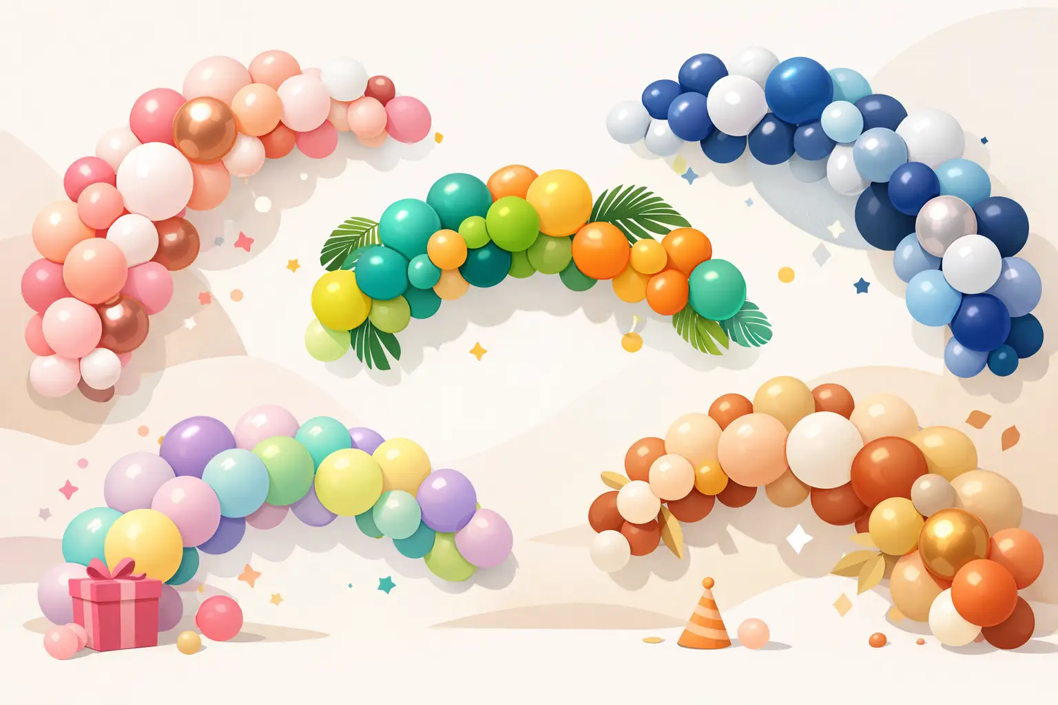
Picking balloon colors sounds easy until you realize the wrong mix can make a beautiful setup feel flat, too busy, or disconnected from the rest of the party. The best balloon garland colors do more than fill a wall – they set the mood, flatter your backdrop, and help the whole celebration look thoughtful in photos.
If you are planning a birthday, baby shower, family milestone, or branded event, color choice matters just as much as the garland shape or backdrop size. A good palette can make a simple setup feel elevated. A mismatched one can compete with the cake, outfit, signage, and table details. That is why the best results usually come from choosing colors that work with your event story, not just colors you like on their own.
How to choose the best balloon garland colors
Start with the feeling you want guests to have when they walk in. Soft and sweet? Bold and festive? Clean and modern? Color creates that first impression before anyone notices the smaller details.
The next thing to consider is what will sit near the garland. If your backdrop is already patterned or your dessert table has lots of bright treats, a calmer palette usually works better. If the setup area is neutral, you have more freedom to go richer or more playful. This is also where outfit coordination can make a big difference. If the guest of honor is wearing blush, sage, white, or gold, a garland in the same family tends to photograph beautifully.
Lighting matters too. Pastels look airy in bright daytime spaces, while deeper tones often stand out better in evening venues or larger rooms. Metallic accents can add polish, but too much shine can overpower the rest of the decor. In most cases, one accent color is enough.
11 best balloon garland colors to consider
1. Blush, white, and gold
This is one of the safest choices when you want a look that feels graceful and celebration-ready. It works beautifully for baby showers, first birthdays, bridal events, and family gatherings. Blush softens the setup, white keeps it clean, and gold adds warmth.
The trade-off is that it can lean formal if every other detail is also very polished. If you want it to feel more playful, add a deeper pink or a peach tone.
2. Sage, nude, and white
For hosts who want something calm, modern, and stylish, this palette is hard to beat. Sage has become a favorite because it feels fresh without being loud, while nude and white keep the look grounded.
This combination works especially well in homes, event halls with neutral walls, and daytime celebrations. It is also flattering in photos and pairs nicely with wood tones, dried florals, and soft signage.
3. Dusty blue, white, and silver
This palette feels crisp and peaceful. It is a lovely fit for baby celebrations, winter birthdays, and elegant family events where you want color without too much intensity.
Silver brings in a cooler finish, so if the room already feels cold, you may want to swap silver for chrome accents sparingly or warm it up with a touch of gray-blue. The goal is balance, not a setup that feels icy unless that is the theme.
4. Peach, coral, and cream
When you want warmth and joy without going neon, peach and coral do the job. This palette feels cheerful and friendly, which makes it a strong choice for spring birthdays, brunch celebrations, and multigenerational family events.
Cream softens everything so the orange-pink tones do not feel too sharp. This is also a good option if you want a feminine palette that feels a little less expected than blush.
5. Lavender, lilac, and soft pink
This combination feels dreamy and sweet, especially for children’s birthdays and baby celebrations. It creates that soft, whimsical look many families want without relying on a single flat color.
The only caution is saturation. If every shade is equally light, the garland can lose depth. Adding one slightly deeper lavender helps the design feel fuller and more intentional.
6. Navy, white, and gold
For a sharper, more dramatic setup, navy brings instant depth. Paired with white and gold, it feels polished and versatile enough for milestone birthdays, graduation parties, and corporate events.
This is one of the best balloon garland colors for clients who want something refined but still festive. Navy also anchors larger installations well, especially against light walls or branded backdrops.
7. Black, white, and chrome gold
If your style leans modern, bold, or upscale, this palette creates a strong visual statement. It is especially effective for adult birthdays, New Year celebrations, and brand-forward events where clean contrast matters.
Black can feel heavy in smaller spaces, so proportion is key. A mostly white base with black and gold accents often looks more balanced than splitting all three colors evenly.
8. Beige, mocha, and white
Neutral balloon garlands have a quiet confidence to them. Beige and mocha feel warm, elevated, and beautifully understated, especially when the rest of the event includes textured backdrops, acrylic signage, or soft florals.
This palette works for many occasions because it does not compete with outfits or table styling. If you want a little more life, add a muted caramel or a small metallic accent.
9. Pink, orange, and yellow
For a party that needs energy, this palette brings it. It feels playful, bright, and full of movement, which makes it a great fit for summer birthdays, children’s themes, and colorful community events.
Because these tones are naturally lively, they work best when the backdrop and table decor stay simple. Too many extra colors can make the whole setup feel busy. When done well, though, this combination is full of happy personality.
10. Emerald, white, and gold
Emerald creates richness in a way that lighter greens cannot. It feels elegant and celebratory, especially for holiday gatherings, milestone dinners, and events where you want the decor to feel memorable.
White keeps the palette fresh, while gold adds the finishing touch. This combination also pairs nicely with floral accents and layered textures if you want a more styled, custom look.
11. Red, blush, and white
This one surprises people. Red can feel intense on its own, but when you soften it with blush and white, it becomes romantic, festive, and full of warmth. It works well for Valentine-inspired setups, anniversaries, and celebrations that call for a little drama.
The key is using red as the accent rather than the main color. That keeps the garland vibrant without making it overpowering.
Best balloon garland colors by event type
Some palettes are flexible enough to work almost anywhere, but a few event types tend to guide the color decision naturally. For first birthdays and baby showers, softer combinations like blush and white, sage and nude, or dusty blue and silver tend to feel timeless in photos. For children’s birthdays, brighter mixes like coral and peach or pink and yellow bring more energy and fun.
Adult birthdays often look best with stronger contrast or richer tones. Navy and gold, black and white, or emerald and gold can make the setup feel more elevated without losing that celebratory spirit. Corporate events are a little different. In those cases, the best color choice often depends on brand colors, logo tones, and the kind of atmosphere the company wants to create. A polished installation should still feel festive, but it also needs to look intentional next to signage and professional photos.
When trendy colors are not the best choice
Trends can be inspiring, but not every popular palette is right for every event. A color combination that looks amazing on social media might feel washed out in your venue or clash with the outfit you already chose. That is why personalizing the palette matters.
A better approach is to use trends as a starting point, then adjust. Maybe you love neutrals but want a little more joy, so you add soft peach. Maybe you like bold colors but need a cleaner finish, so you bring in white to create breathing room. The best designs are rarely copied exactly. They are tailored.
A simple way to narrow it down
If you feel stuck, choose one main color, one supporting color, and one neutral. That alone gives the garland shape and contrast without making the decision overwhelming. You can always add a small accent later if the setup needs extra sparkle or depth.
This is often how custom event styling comes together most smoothly. Instead of picking five colors because they all look pretty separately, it helps to build around one clear direction. At Party Hub Decor, that usually means looking at the theme, the backdrop, the outfit, and the room itself before finalizing the palette.
The right balloon garland colors should feel like they belong to your celebration, not like they were pulled from a generic party aisle. When the colors fit the moment, the whole setup feels easier, more polished, and much more memorable. If you are choosing between two palettes, go with the one that feels most like your event story – that is usually the one guests remember.
Leave a Reply