
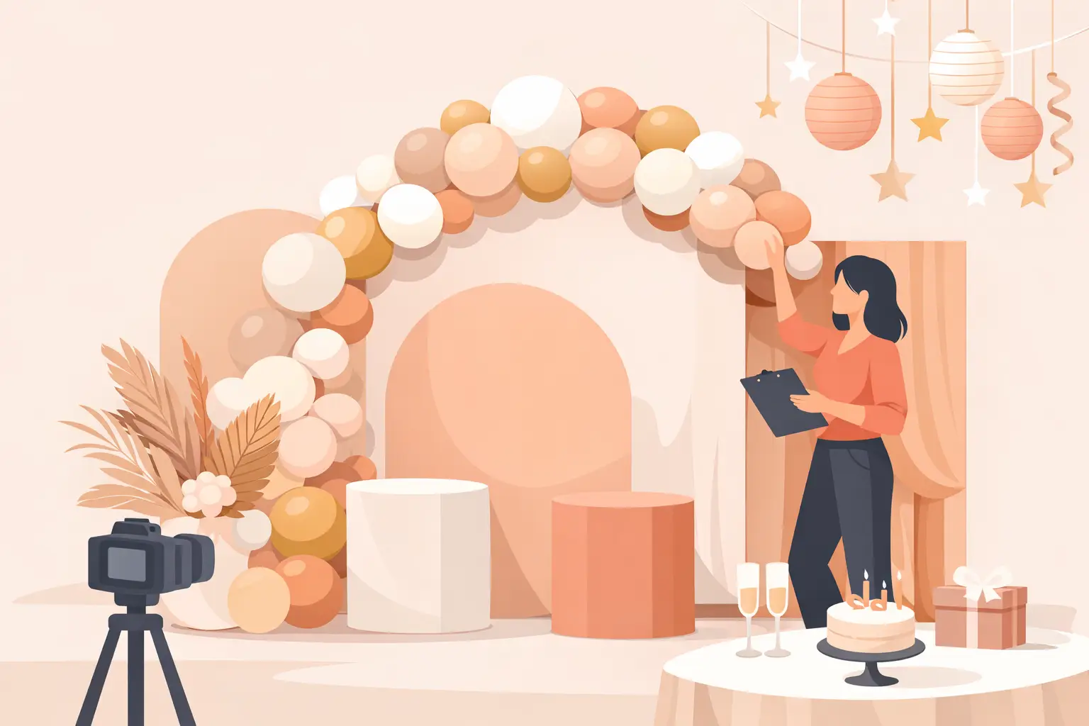
You can spot a well-matched party setup the second guests walk in. The backdrop feels connected to the balloons, the cake table, the outfit, and the mood of the event. If you have been wondering how to match party backdrop details without making the space feel busy or mismatched, the secret is not adding more. It is choosing one visual story and letting every piece support it.
A beautiful backdrop does more than fill a wall. It becomes the photo moment, the anchor for the room, and often the first thing people remember from the celebration. That is why matching it well matters. When it works, the entire event feels polished and intentional. When it does not, even lovely decor pieces can start competing with each other.
Start with the one thing that matters most
Before choosing fabrics, shimmer panels, signs, or balloons, decide what should lead the design. For some parties, that is the theme. For others, it is the outfit, the venue, or one specific color palette.
A child’s birthday might begin with a character, safari animals, or a race car concept. A baby shower may start with soft neutrals and a sweet message. A milestone birthday often works best when the design begins with the guest of honor’s personal style rather than a trendy decoration you saw online.
This is where many people get stuck. They try to match everything equally, and the result feels crowded. A better approach is to choose one lead element and let the backdrop support it. If the celebrant is wearing a bold royal blue dress, the backdrop can echo that shade in a softer way instead of repeating it everywhere. If the venue already has warm brick or dark walls, the backdrop should balance that environment rather than fight it.
How to match party backdrop colors without overdoing it
Color is usually the first thing guests notice, and it is also where matching can go wrong fast. The safest choice is not always using the exact same color in every part of the setup. Exact matches can look flat. Good styling usually comes from color relationships.
Think in layers. Start with one main color, add one supporting color, and then bring in one accent. For example, blush, ivory, and gold feel soft and elegant. Sage, cream, and muted peach feel fresh and calm. Black, white, and silver feel sharp and modern for adult birthdays or corporate events.
If your backdrop is printed, textured, or detailed, keep the balloon palette simpler. If your balloon installation is full and colorful, the backdrop should give it room to stand out. Not every piece needs to be the star.
It also helps to pay attention to undertones. This small detail changes everything in photos. A cool pink and a warm beige may both seem neutral on their own, but together they can feel slightly off. The same goes for bright white versus soft white. Matching is not only about color names. It is about whether the tones feel like they belong together.
Match the backdrop to the outfit, not against it
One of the smartest ways to design a party setup is to think about the photos before the event starts. Guests, especially the host or guest of honor, will stand in front of the backdrop again and again. If the clothing and backdrop clash, the photos can feel chaotic even when the decor is expensive.
That does not mean the backdrop has to copy the outfit exactly. In fact, contrast often works better. A black dress pops beautifully against warm neutrals, metallics, or soft blush tones. A pastel outfit usually looks best in front of a setup with slightly deeper shades or added texture so the person does not disappear into the background.
For children’s parties, the birthday outfit can be a great starting point. If the child is wearing a bright themed outfit, the backdrop should support that energy without becoming visually louder than the outfit itself. If the outfit is simple, the decor can carry more personality.
When clients ask for guidance, this is often one of the most helpful planning steps because it ties the whole celebration together in a way that feels effortless on camera.
Theme matters, but mood matters more
A theme gives direction, but mood is what makes a party feel elevated. Two events can share the same theme and look completely different depending on the styling choices.
Take a butterfly party. It can be whimsical and pastel, bold and garden-inspired, or modern with clean shapes and soft shimmer. A jungle party can lean playful for a toddler or chic and tropical for an adult birthday. The backdrop should reflect the feeling you want, not just the theme name.
This is why copying a photo exactly does not always work. Your venue size, lighting, guest count, and furniture all affect the final result. A setup that looked perfect in a bright studio may feel too dark in a banquet hall. A grand layered backdrop may overwhelm a small living room. Matching well means adapting the concept to the actual event space.
How to match party backdrop elements with balloons and props
Backdrops rarely stand alone. They usually share space with balloon garlands, plinths, cake stands, cutouts, signage, and table decor. The easiest way to make all of these elements feel connected is repetition with restraint.
Repeat shapes, finishes, or colors in a few places. If your backdrop has soft arches, curved plinths and rounded balloon movement will feel more natural than sharp, boxy details. If your sign is gold acrylic, adding a small gold accent in the cake stand or favor display creates continuity. These little echoes help the full setup feel designed rather than assembled piece by piece.
Scale matters too. A large statement backdrop can handle fuller balloon styling and bigger props. A smaller backdrop needs more breathing room. Oversizing every element is a common mistake, especially in home parties where the setup area looks bigger in photos than it feels in person.
There is also a practical side. If the backdrop is the main photo area, leave enough open space for people to stand comfortably. Decor should frame the moment, not block it.
Let the venue help you choose
The best backdrop is not chosen in isolation. It should make sense for the room where the celebration is happening.
If the venue has patterned carpet, strong wall colors, or dramatic lighting, a simpler backdrop often works better. If the room is plain, you can bring in more texture, layers, or color because the setup needs to create the atmosphere.
Ceiling height is another detail people overlook. A tall backdrop can look stunning in a hall and feel awkward in a low-ceiling basement. Width matters just as much. If the backdrop is too narrow for the balloon design or cake table, everything starts to feel squeezed.
In homes and community spaces across Kitchener, Waterloo, and Cambridge, a thoughtful setup often beats an oversized one. Matching the decor to the room gives you a cleaner, more comfortable result and better photos from every angle.
When custom is worth it
Sometimes a ready-made backdrop works perfectly. Other times, custom styling makes a huge difference. If the event is centered around a specific outfit, branded celebration, faith-based message, milestone age, or meaningful family theme, custom details help the setup feel personal rather than generic.
That might mean a custom sign, a printed panel, coordinated favors, or a color palette built around the client’s vision instead of a standard package. The value is not only in appearance. It also removes the stress of trying to source separate pieces and hoping they all match when they arrive.
This is where working with an experienced decorator can save time and second-guessing. A well-planned setup considers the visual details, but it also accounts for installation, spacing, timing, and how the full design will photograph once guests arrive.
A simple way to decide faster
If you feel overwhelmed, narrow your choices by asking three questions. What is the main mood of the event? What will the guest of honor wear? Where will the backdrop be placed?
Those answers usually point you in the right direction faster than scrolling through dozens of inspiration photos. Once you know the mood, the outfit, and the space, the right backdrop style becomes much easier to identify.
A party backdrop does not need to be the loudest thing in the room to be memorable. It needs to feel connected, flattering, and thoughtfully placed. When every detail supports the same vision, the celebration feels lighter to plan and more beautiful to enjoy. If you are choosing pieces for an upcoming event, trust the setup that feels cohesive over the one that simply looks busy. That is the one guests remember, and the one your photos will thank you for.
Leave a Reply