
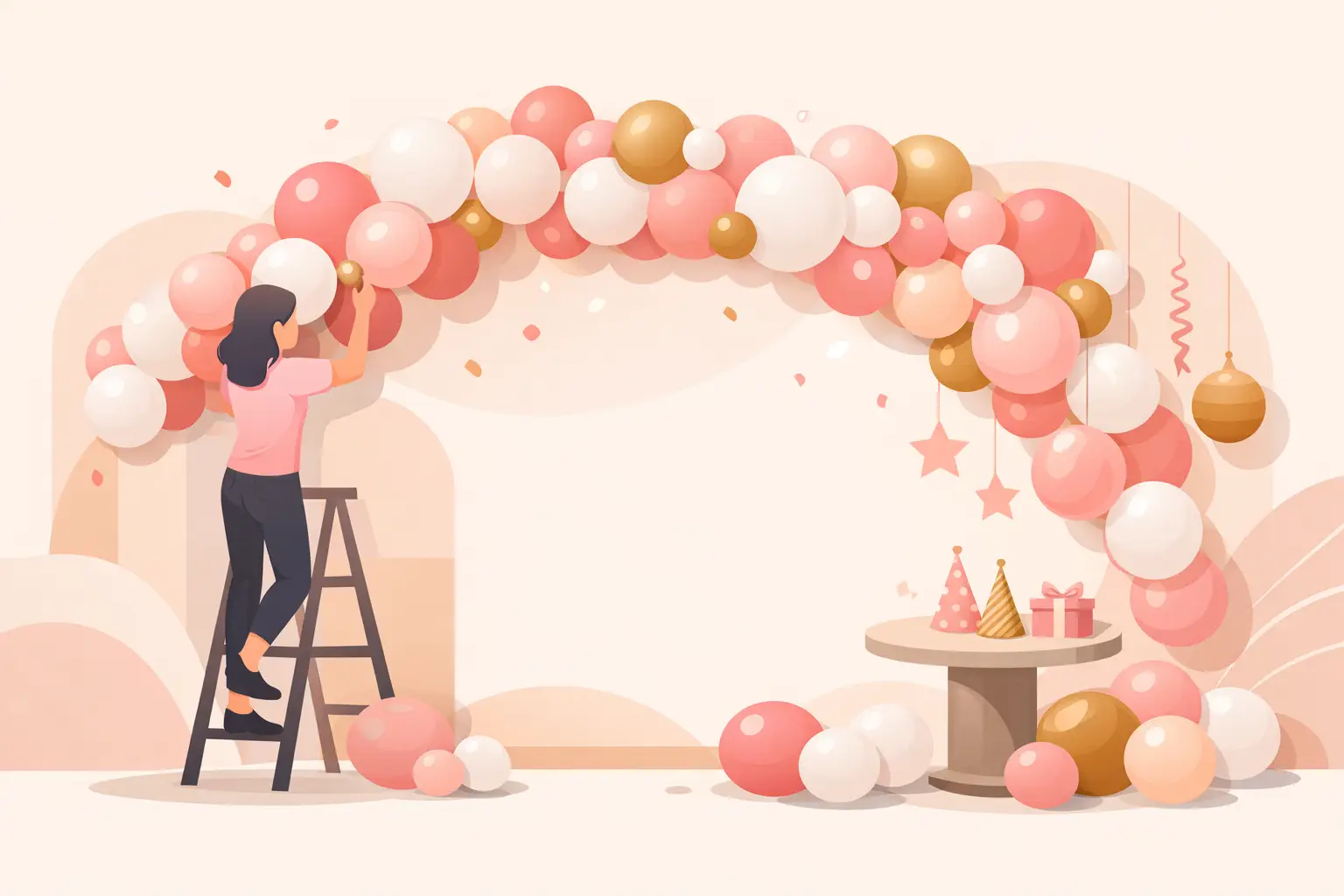
A balloon garland can look effortless in photos and still feel completely overwhelming when you are standing in front of a pile of balloons, tape, and a blank wall. If you have been searching for how to style balloon garlands in a way that feels polished instead of random, the biggest shift is this – stop thinking about balloons as party supplies and start thinking about them as part of the full event design.
When a garland works, it is because the size, color story, placement, and surrounding decor all support one another. That is what makes it feel elevated in person and beautiful in photos. Whether you are planning a birthday, baby celebration, family milestone, or branded event, styling matters just as much as assembly.
How to style balloon garlands with a clear theme
The easiest way to make a balloon garland look intentional is to anchor it to a theme before you choose a single color. That theme does not have to be overly complicated. It can be as simple as garden birthday, soft neutral baby shower, race car party, modern graduation, or elegant corporate launch.
Once the theme is clear, your balloon choices become much easier. You are no longer picking colors because they are pretty on their own. You are choosing them because they support a mood. A soft blush and ivory mix gives a very different feeling than bold red, royal blue, and yellow. Both can be beautiful. It depends on the event, the space, and the person you are designing for.
This is also where many DIY setups start to feel disconnected. The balloons may look nice, but they do not relate to the cake table, the backdrop, the signage, or the guest of honor’s outfit. A garland feels more refined when it belongs to the whole scene.
Start with the right color mix
Color is usually the first thing guests notice, and it sets the tone right away. A good rule is to work with three to five shades rather than every color tied to the theme. Too many tones can make the arrangement feel busy, especially in smaller rooms or around detailed backdrops.
A balanced palette usually includes a main color, a supporting color, and one or two softening shades. For example, dusty blue with white and silver feels crisp and modern. Peach, sand, and cream feels warm and gentle. Black, gold, and white reads bold and celebratory. If you want more depth, adding one darker shade can keep the garland from looking flat.
There is also a trade-off here. High contrast photographs beautifully and grabs attention, but soft tone-on-tone palettes often look more upscale. If your event already has patterned linens, character graphics, or strong florals, a simpler balloon palette usually works better.
Match the room, not just the invitation
One of the smartest styling decisions is to consider the venue colors before finalizing your balloons. Wall color, flooring, natural light, and furniture all affect how a garland will read. A white and beige setup can feel dreamy in a bright room and disappear against a cream wall. A vibrant palette can energize a neutral space and feel overpowering in a colorful hall.
If your celebration includes a focal wall, dessert table, or welcome area, build the garland around that visual center. It helps the setup feel grounded instead of floating without purpose.
Build shape before you add extras
A stylish balloon garland is not just about color. Shape does a lot of the heavy lifting. The most appealing garlands have movement. They curve, taper, and frame a space in a way that leads the eye naturally.
That usually means avoiding one long, evenly stuffed tube of balloons. Instead, think in clusters with variation. Larger balloons create structure, medium balloons fill the body, and smaller balloons soften gaps and add dimension. This mix is what gives garlands that organic, custom look people love.
Placement matters too. An asymmetrical design often feels more modern and photo-friendly than a perfectly centered arch. A garland that starts fuller at one end and trails off at the other can frame a backdrop beautifully. For dessert tables, a side-swept design often looks cleaner than covering the entire top edge.
Leave breathing room
One common mistake is overfilling every inch. More balloons do not always mean more impact. If the garland is too dense from end to end, it can hide the backdrop, crowd the table, and make the entire setup feel heavy.
A better approach is to let some areas stay lighter. That spacing gives shape definition and allows other design details to shine. If you are using cutouts, signage, florals, or a cake display, the garland should frame those elements, not compete with them.
Add texture with purpose
The finishing details are what take a balloon garland from basic to styled. This can include specialty balloons, florals, greenery, ribbon, fabric, bows, themed cutouts, or signage. The key is using these accents with restraint.
If the event is playful and bold, themed add-ons can bring personality. If the event is elegant or faith-centered, softer touches often work better. A few carefully placed accents usually create more impact than covering the entire garland with decor.
Texture should also make sense for the occasion. Greenery can soften a bridal or garden-inspired setup. Metallic accents can sharpen a graduation or New Year’s design. Custom name signs or age numbers help personalize milestone celebrations. For children’s parties, themed elements should be clear enough to support the party vision without turning the display into visual clutter.
This is where styling becomes collaborative. The best installations reflect the family, the guest of honor, or the brand behind the event. A garland should not feel copied from a trend if the rest of the celebration tells a different story.
Think about what the camera will see
Balloon decor is almost always photographed, which means styling should work from the guest view and the camera view. Before finalizing placement, stand back and imagine where people will take pictures. Most guests will gather near the dessert table, welcome sign, or main backdrop, so that is where the garland should make its strongest statement.
Good photo styling usually means keeping the focal area clear. Faces, cakes, signage, and key details should not be blocked by oversized clusters. It also helps to avoid placing the fullest part of the garland exactly where people will stand. Framing the sides or top corner often gives better balance in photos.
Lighting matters too. In darker venues, lighter shades can help the garland read better on camera. In bright spaces, deeper tones can add contrast. If your event is in a mixed-light room, it is worth choosing colors that still look flattering under both daylight and indoor lighting.
Use the garland to support the full setup
The most polished balloon styling never happens in isolation. A garland should connect with the entire celebration, from the cake stand and table styling to the favors and backdrop pieces. When everything feels coordinated, even a simple setup can feel premium.
This does not mean every element needs to match exactly. In fact, a little contrast can create depth. What matters is consistency in mood and finish. A sleek modern backdrop pairs best with clean color blocking and minimal accents. A sweet family party may call for softer layers, themed props, and warmer colors.
At Party Hub Decor, this is often where clients feel the most relief. Once the decor is treated as one complete visual story instead of separate items, decision-making gets easier. The garland stops being one more task on the list and starts becoming the statement piece that pulls everything together.
When simple is better
Not every event needs a dramatic, oversized install. Sometimes the most beautiful balloon garland is a smaller design placed exactly where it will have impact. For a living room birthday, a compact garland over a cake table can feel polished without taking over the space. For a corporate event, a cleaner, more structured arrangement may fit the brand better than a playful organic shape.
It really depends on the room, the guest count, and the role the decor needs to play. If the food table is the main attraction, keep the garland supportive. If photos are central to the celebration, let the garland lead the scene. Styling is not about adding more. It is about choosing what deserves attention.
A well-styled balloon garland should feel like it belongs there, as if the celebration would look incomplete without it. When the colors are thoughtful, the shape has movement, and the surrounding details are considered, the result feels joyful, personal, and easy on the eyes. Start with the feeling you want guests to have when they walk in, and let that guide every styling choice from there.
Leave a Reply