
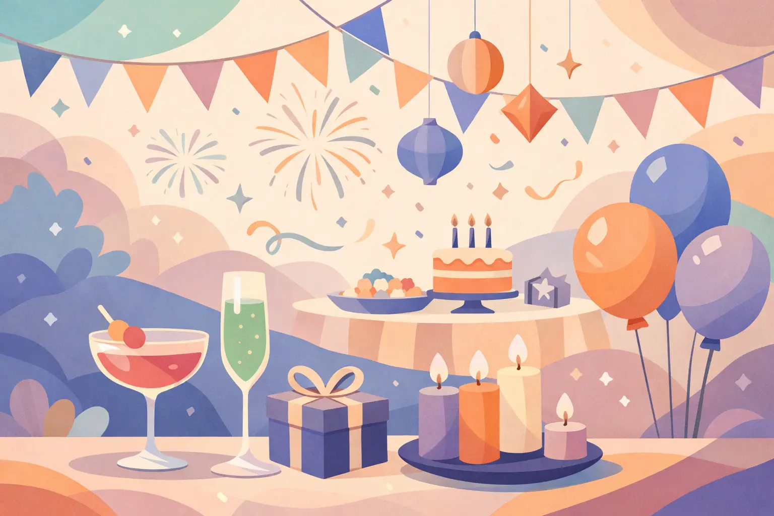
A great party palette does more than fill a room with color. It sets the mood before the cake is cut, gives guests a beautiful place to gather, and makes every photo feel connected. The party color trends 2026 are moving toward palettes with more personality: thoughtful contrasts, layered finishes, and colors chosen to reflect the guest of honor rather than a one-size-fits-all theme.
For hosts planning birthdays, baby celebrations, anniversaries, graduations, or corporate gatherings, this is welcome news. The most memorable celebrations will not be built around a single trendy shade. They will use color to tell a small, joyful story.
Party Color Trends 2026: More Depth, Less Matching
Perfectly matched décor is giving way to coordinated layers. Instead of choosing one pink, one gold, and one white, 2026 palettes feel richer when they include lighter and deeper versions of a color, plus one unexpected accent. This approach adds dimension to balloon garlands, backdrops, tablescapes, cake stands, and custom favors without making the setup feel busy.
Think of a blush celebration with dusty rose, raspberry, soft peach, and warm ivory. Or build a blue party with powder blue, denim, navy, and a small touch of silver. The colors still belong together, but they have enough contrast to photograph beautifully from every angle.
This does not mean every event needs five or six bold shades. A quiet, neutral palette can be just as striking when it includes texture and tonal variation. Cream, sand, taupe, mocha, and pearl create a refined look for a baby shower, milestone birthday, or intimate family dinner. The key is choosing colors with similar warmth so the overall design feels intentional.
Earthy jewel tones feel celebratory and grown-up
Deep, nature-inspired colors are becoming a favorite for hosts who want warmth without the formality of a traditional black-and-gold event. Forest green, olive, terracotta, cinnamon, plum, burgundy, and deep teal bring instant richness to milestone celebrations and fall or winter gatherings.
These tones work especially well with soft neutral backdrops and warm metallic details. A burgundy and blush palette feels romantic for an anniversary. Terracotta, sage, and cream suit a boho-inspired baby celebration. Deep teal with copper or champagne details can give a corporate event personality while still looking polished.
The trade-off is that darker colors need breathing room. If every element is deep and saturated, a smaller venue can feel visually heavy. Balance them with ivory, soft beige, pale pink, or clear display pieces so the focal area still feels bright in photos.
Playful brights are returning with intention
Not every 2026 party is subtle. Bright color is back for children’s birthdays, summer gatherings, graduations, and joyful brand events, but it is being used with more direction. Rather than a full rainbow scattered across every surface, hosts are choosing two or three confident colors and grounding them with a neutral.
Cherry red, butter yellow, cobalt blue, bright coral, and crisp aqua are strong choices for a high-energy look. A red, pink, and cream palette can feel sweet and fashion-forward. Cobalt, yellow, and white creates a sunny, clean visual. Coral with peach and turquoise brings a vacation-inspired mood to a backyard celebration.
For a child’s party, bright colors can also be tailored around a favorite character, outfit, or activity without making the entire event feel overly themed. A custom backdrop and balloon installation can carry the biggest color moment, while the cake table and favors echo just one or two shades from the design.
Soft Metallics Replace the All-Gold Look
Gold will always have a place at celebrations, especially for anniversaries, graduations, and milestone birthdays. In 2026, however, the look is softer and more layered. Champagne, pearl, brushed silver, rose gold, and warm copper are being used as accents instead of taking over the palette.
This shift makes the décor feel elevated while allowing the main color story to shine. Pair pearl details with lavender, pale blue, or soft pink for a delicate, airy celebration. Add brushed silver to navy, icy blue, or black for a modern evening event. Copper is beautiful beside rust, cream, olive, and deep teal.
A metallic accent works best when repeated in a few meaningful places: a cake stand, a name sign, a backdrop detail, or favor packaging. Too much shine can compete with the faces and moments you actually want photographed.
The Best Palette Starts With the Person Being Celebrated
Trends are useful for inspiration, but personal details create the magic. Before choosing colors, think about the guest of honor’s style. Do they love soft, romantic looks or bright, playful ones? Are they wearing a special outfit? Is the event happening in a sun-filled home, a community hall, a restaurant, or outdoors?
Outfit coordination matters more than many hosts realize. If the birthday child is wearing royal blue, the décor can include blue as a focal color while balancing it with white, silver, yellow, or orange. If a mom-to-be has chosen a sage dress, adding sage into the backdrop makes her feel naturally connected to the design instead of disappearing into it.
The venue also affects what will look best. A room with dark walls may need lighter backdrops and brighter accents. An airy venue with lots of natural light can handle deeper jewel tones. For an evening event, reflective details and contrast help the setup stand out after the sun goes down.
Use the 60-30-10 idea without making it rigid
A simple way to build a balanced palette is to give one main color the largest role, use a supporting color in smaller amounts, and reserve an accent for the finishing touches. For example, cream may lead a neutral baby shower, sage may support it, and gold may appear in the lettering and tabletop details.
Treat this as a guide, not a rule. A balloon garland may naturally include more of the supporting color to create movement. A bold backdrop may place the accent color front and center. What matters is that the eye has a clear place to land.
Color Drenching Creates a Strong Photo Moment
One of the most exciting party color trends for 2026 is color drenching: using related shades across the backdrop, balloons, signage, cake display, and tabletop details to create an immersive focal area. It can be dramatic, but it does not have to be loud.
A lavender celebration might layer lilac, orchid, plum, and pearl. A blue setup might move from sky blue to navy with silver highlights. Even an all-neutral display can use cream, latte, caramel, and brown for a warm, editorial feel.
The secret is variation. Different shapes, finishes, and heights prevent one-color décor from looking flat. A handcrafted favor in a coordinating shade can make the celebration feel complete, giving guests a thoughtful detail to take home after the photos and cake are finished.
Build a Trend-Forward Setup That Still Feels Timeless
When planning your palette, choose one trend-led element and keep the rest personal. Maybe that is a butter yellow accent, a deep plum focal color, or pearl-inspired detailing. Then anchor it with colors you already love and details that fit the occasion.
This approach is especially helpful if you are investing in professional party décor. Your photos should feel current, but they should also feel like your family, your milestone, and your celebration. Party Hub Decor helps hosts bring those ideas together through custom backdrops, balloon designs, coordinated display pieces, and meaningful finishing details designed around the event.
The most beautiful color choice is the one that makes the guest of honor light up when they walk into the room. Start there, then let the 2026 trends add the extra sparkle, warmth, and personality that turns a gathering into a memory worth keeping.
Leave a Reply